

Tuesday, February 24, 2009

Thursday, February 19, 2009
Due on Tue. Feb 24
Please bring to class:
45 thumbnails of your sequential pieces. (That equals out to 15 different versions of your idea.)
We will have a heavy critique in class. Plus a demo or two.
45 thumbnails of your sequential pieces. (That equals out to 15 different versions of your idea.)
We will have a heavy critique in class. Plus a demo or two.
Tuesday, February 17, 2009


Shakespeare Version 2

Version two, added the fourth part of the Jester hat, and fixed the tusks to be darker/more dingy.


Shakespeare Poster Revisions

Heavy, heavy revisions since the last time this was seen. I wanted a much more dramatic feel to things and decided to completely redo the 'castle' at the summit of the cliff. I played around with type for a while until I found a combo that I liked and utilized a quote made by Macbeth during Act I Scene III (if I remember correctly...) that seemed to fit the mood of the composition. I hope everyone will agree that this is far better than its predecessor! :-P

Monday, February 16, 2009

.jpg)
Shakespeare poster update

Hi. Worked on suggestions. My changes are pretty subtle. Hopefully I got rid of that white line. Worked on Romeo's forehead and I think it's better. Added touches of highlights into the liquid and picked a new font for the heading.
Saturday, February 14, 2009
Chad Sutton -- Macbeth Poster

Made some adjustments to it. Fixed the title at the bottom, and worked on finishing her and cleaning her up a bit more.
If you see this in the next few days or so and spot something to critique, please feel free to comment. I'll probably send this in for the gallery if it's all right. But lemme know if you spot something I missed! Thanks. :)
Wednesday, February 11, 2009
.jpg)

Tuesday, February 10, 2009


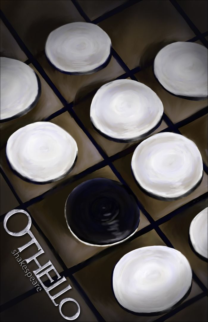
Othello...
Shakespeare Poster
 I'll admit, I'm a little embarrassed to post this "work-in-progress". Other things have come up over the course of the last week, illness notwithstanding, and I've not worked on this piece as much as I should have. Obviously, the sword needs more work, the mountainside needs some actual painting and tonality, and the castle at the top needs some texture and detail work. The text is just place-holder stuff for now, to give an idea of where I was intending to put the final copy. The groundwork is definitely in place for something strong, I just need more time to finish it.
Julius Ceasar

This is my Shakespeare Julius Ceasar poster. Overall, I'm pretty happy with most of it.

Monday, February 9, 2009

Saturday, February 7, 2009

Wednesday, February 4, 2009
Due on Tue. February 10
Please post your Shakespeare Posters to the blog before class.
I'm excited to see them!
I'm excited to see them!
Tuesday, February 3, 2009


Duotone Assignment


Was going to do 3 but didn't. I don't feel I'm doing great with Painter yet, but I'm starting to see some possibilities.
Cady B Duo Color #2

Alright, this has been updated now. The wings were changed/made less "cloud-like"


Molli Duotone
 hmm...Well...the idea was there, but the execution....Not my favorite work. Felt like I was kinda fighting this piece the whole time. But it worked out more or less in the end.

Duotone Assignment - update 2/8/2008

As per the class's suggestions, I pulled some of the yellow tones into the shirt and cleaned up the lines on the shirt to make it look more "finished". I also lightened up the eyes a bit, but not so much as to make the feller look 'alive'. Lastly, I threw in a bit of spittle around the mouth as I was detailing the teeth to make him look a bit more feral.

Monday, February 2, 2009
Monster Boy
 I feel like he needs a background, but I can't think of what I should put. I also really want a tablet now. Working on just a laptop mousepad doesn't quite cut it.
Jade Stevens- Assignment #2: Color Duo

Eh, well, here it is. This was the best I could do, given I could only get down to the CNM last Friday and on Monday... I suppose it looks alright.
Subscribe to:
Comments (Atom)